
Tuesday, January 20, 2009
I think I'm ready to show this
This is a piece that I was asked to do by a friend. She wanted a custom Venture Bros drawing, preferably featuring The Monarch and Dr. Girlfriend. The who and why will be revealed later on, as it's too exciting for just one post.

Monday, January 19, 2009
The Character Toy Archive
Time to post about something near and dear to my heart...toys.
I love toys and I love collecting them. I like to think that I collect toys in much the same way that people collect baseball cards or coins, which is to say in a respectable, hobbyish way. But I guess at the end of the day I'm still a twenty-something with a wall full of action figures.
At any rate, my friend Dave has been collecting toys his whole life and has started a blog to archive his collection. Starting a collection of toys when you're a kid may seem like an obvious thing to do since all kids love them, but Dave is different in that he just seems to have been born with that collector's instinct. When most kids decided it was time to put their toys in a yard sale and leave their childhood memories behind, Dave put his toys away on shelves or in carefully kept boxes.

Having witnessed first hand the sheer amount of collectibles that Dave has in his possession as well as the caliber of his rarities, novelties, and things that make you say "oh my God, I remember that!" or "where did that come from?" I can safely say that he has enough material to keep posting for quite some time.
Check out his site at The Character Toy Archive
Saturday, January 17, 2009
About the New Pepsi Logo
Every so often something is able to remind me just how much of a graphic designer I still am even though I like to focus on illustration. Pepsi's redesigned logo is one such thing, which I'm sure many of you have seen by now.

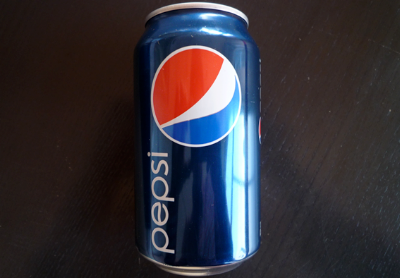
(Images from this article.)
I absolutely love it. I've read that reactions to it are mostly negative, which I guess doesn't surprise me too much. When something that we're familiar and comfortable with gets changed we tend to not be too happy about it. I am as guilty of this as anyone else. Sometimes I'll find myself looking up old restaurant or gas station logos and thinking "That old logo was so great, why did they change it?" (This is something only graphic design nerds do, I would assume. You wouldn't believe how excited I was when I found out that they made entire books full of good diagram designs. Sad, I know.)
So let me tell you why I like it. First, the design itself is just...good. I don't really think there's any denying that even if you prefer an older version of the logo. (The 70's vesrion is my favorite.) It's clean and simple, which is very hard to pull off. Second, and more importantly, it's the first major step away from the whole "X-TREME!" branding trend that has been present for far too long. The kids that grew up with brand designs full of unnecessary X's and pointy lettering have, well, grown up. I like that Pepsi did a complete 180 from those elaborate, messy, and gradient filled visuals and were able to do it well.
I've also found that this logo allowed me to prove to myself that my design sense is stonger than my sense of nostalgia. What I mean by that is tied to what I was saying earlier: I, like most people, look at older versions of logos with much more fondness than their newer redesigns. Take for example this image I found in an article you can read here:

Don't you find yourself looking at the older logos and saying "Oh man, I remember when it looked like that! It was so much better!" Now also notice that every one of the older logos is much simpler, and every one of the newer logos took some element of it's older self and put it on a diagonal axis. (See how the words "Burger King," "Pizza Hut," and "KFC," are all slanted, and the bell in the Taco Bell logo is at an angle.) Also see how shine marks were added to BK and Taco Bell, and that the details on the Colonel are much more elaborate.
So the fact that I liked the new Pepsi logo right off the bat proves to me that I don't like all these older logos just because I remember them from when I was a kid, but rather because they are genuinely better logos. Tell me what you are with solid design, not by following a trend that has worn out its welcome.
Tuesday, January 13, 2009
Spidey and His Amazing Friends
Here is a small portion of the first image I created for Cereal:Geek Magazine a while ago.

I'm not sure what the ethics are on posting these things before they're printed, hence the sample.
The owner of the magazine, James, had an unexpectedly enthusiastic response to the piece so here's hoping everything pans out.

I'm not sure what the ethics are on posting these things before they're printed, hence the sample.
The owner of the magazine, James, had an unexpectedly enthusiastic response to the piece so here's hoping everything pans out.
Friday, January 9, 2009
DTV!
This doesn't have much to do with anything, so I apologize.

I mainly just liked this graphic. I got it from an article on Geekologie about how Obama is trying to get the analog TV shut off date extended (which has been done multiple times at this point.)
This graphic reminds me of how digital is good, but not necessarily better, in my opinion. At least not on all fronts. It's kind of like the difference between a painting and a photo of a painting. The photo is limited to the restraints of its technology, whereas the painting can be infinitely detailed if you get close enough. Not that analog isn't a form of technology, but...I don't know where I'm going with this.
At any rate I did switch to receiving HD channels over the air last weekend and it's pretty incredible. A common misconception is that you need a special antenna to pick up HD channels...not so. The same rooftop eyesore that your grandmother has used since the 50's can get HD. They just put "HD compatible!" and things of that nature on the box because they want to cash in on ill informed consumers. And it's funny that people are still so ill informed considering how many commercials they run about this subject. I guess it's mainly due to the fact that these commercials are devoid of any useful information.
All you need to get HD channels is a TV that's HD compatible and an antenna, that's it. None of this converter box stuff unless you have a non-HD TV. It's that simple. You know if your TV is HD compatible because all HD channels have a decimal point. (unless you already get them through a cable box, which most people who have them do.) For example, 3.1 or 4.5 or 97.48 If you don't have the ability to input a decimal point on your remote then you can't see the channels (hence what the converter box is needed for.) Why they don't just tell people that in the commercials and avoid all this confusion is beyond me.
This has been an Albino Raven public service announcement.
Subscribe to:
Posts (Atom)